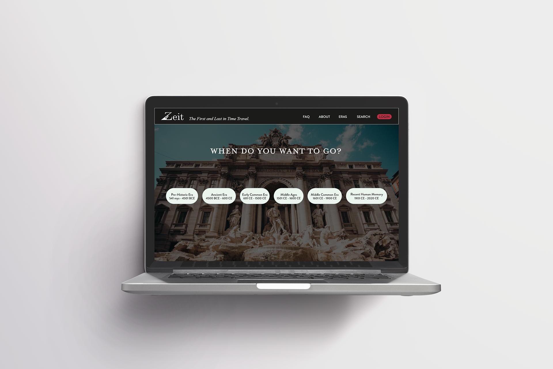
Home Screen created by Hana Jimenez - Mockup PSD created by customscene
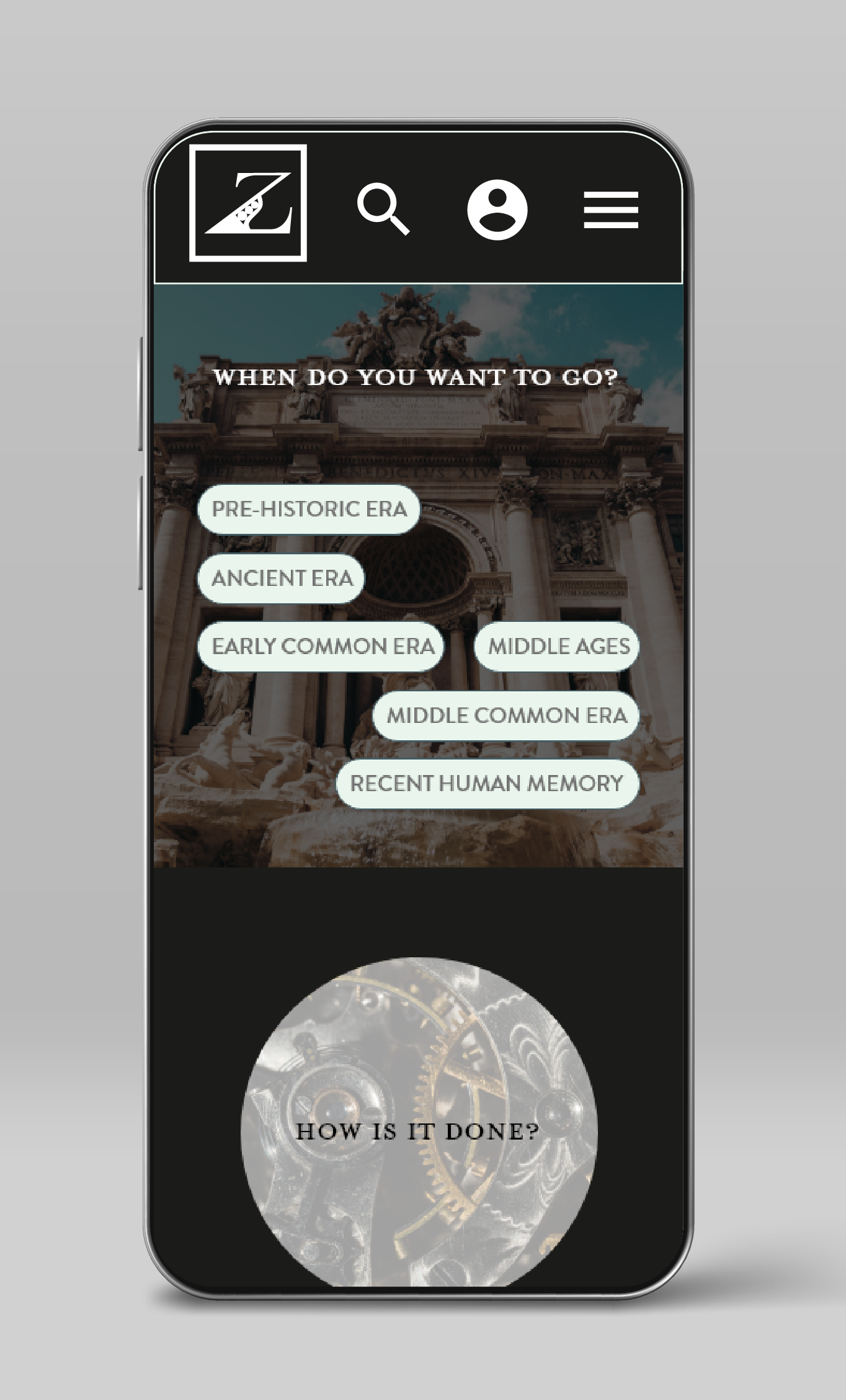
Home Screen created by Hana Jimenez - Mockup Vector created by upklyak
Overview
The prompt was to make a website and brand, for a fictional time travel company called Zeit. The project attracted me because it posed an interesting challenge, while also allowing for many interpretations.
Questions
The primary questions to be addressed during the design process for Zeit were:
What do people want out of an online booking experience?
What do people need in order to feel comfortable time travelling?
Zeit Expanded Logo - Hana Jimenez 2020
Phase One: Research
Research Goals
- Discover what features are desirable to the user in a successful booking website.
- In a choice between two booking websites, discover what is the deciding factor and why.
- Learn what a user wants from their time travel experience, and their time travel booking experience.
User Interviews
I conducted 5 interviews with people from various demographics, all via phone call, to learn more about the potential user base for Zeit. My questions primarily focused on prior travel booking experiences, with some delving into what the interviewee might like to see from Zeit, and how they perceive themselves with regards to risk and adventure.
Persona
I synthesized Jared from my research findings to serve as a way to keep the user and the user’s needs in mind as I continued designing. In accordance with my findings I made Jared interested in travel and new experiences, while also being cautious about losing modern comforts and high costs. Jared helps me to keep the user in mind and, consequently, keep the design simple and accessible.
Phase Two: Define
Card Sorting and Sitemap
After the interviews and the creation of a persona, it was time to begin working on the structure of the site. I conducted a card sorting exercise so as to understand how people separated the eras into different categories, and from there I created both a task flow, and finally a user flow.
Card Sorting
I started by renaming the card sorting entries to standardize them, I did not want the names to influence the categorizing more than necessary. I then made 4 categories for the participants to use as a jumping off point. These categories were "Pre-historic Era", "Ancient Era", "Post-Classical Era", and "Modern Era". Not all participants finished categorizing the items and not all participants made new categories. There was a lot of use and agreement within the original 4 categories, but several of the participants made similar categories such as "Middle Common Era". One participant also separated the categories into "Era" and "Era Events". This data has provided me some insight into how people organize events and timespans.
Dendogram: Best Merge Method
The BMM algorithm breaks each instance of a category from every participant down into their base pairs. The pair with the highest score is locked in. This repeats, and where the pair being locked in intersects with an existing locked category, it is agglomerated with this category. All subsets of this new category are eliminated.
Sitemap
After the card sorting, and a bit of research into travel booking website structures, I was able to construct a comprehensive sitemap.
Task Flow
I made a basic task flow based on some of my own experiences with travel websites, and informed by the research I did with my interviews. It was a useful immersion exercise, and allowed me to understand how people might navigate my site.
User Flow
I then constructed a user flow using my persona Jared to help understand how he might navigate the flow of the website, a much needed step between sitemap and wireframes.
Phase Three: Design
Preliminary Sketches
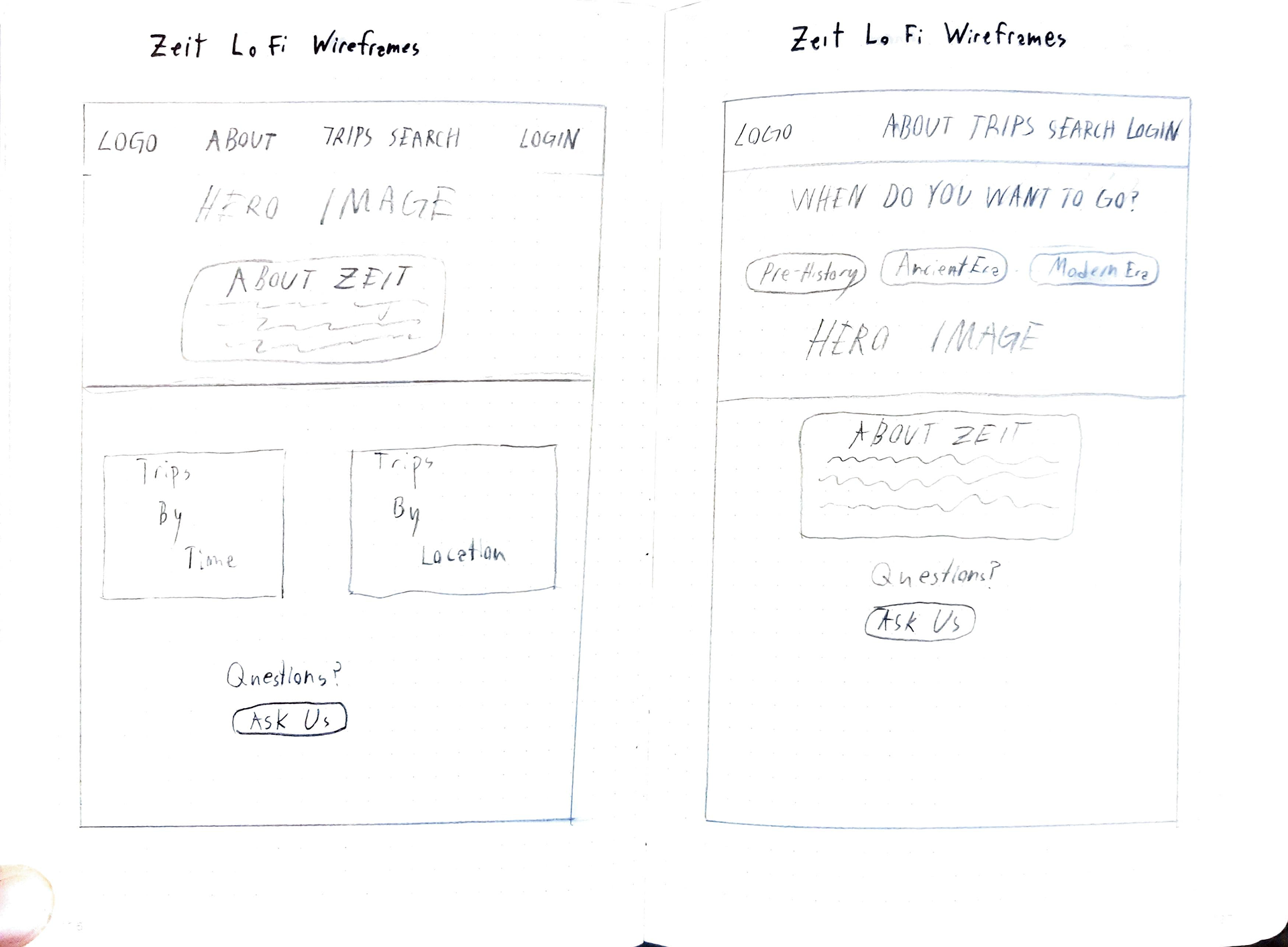
Finally, it was time to design. I drew up some loose sketches using my previous knowledge and experience, making sure to keep flow, white space, and visibility in mind.
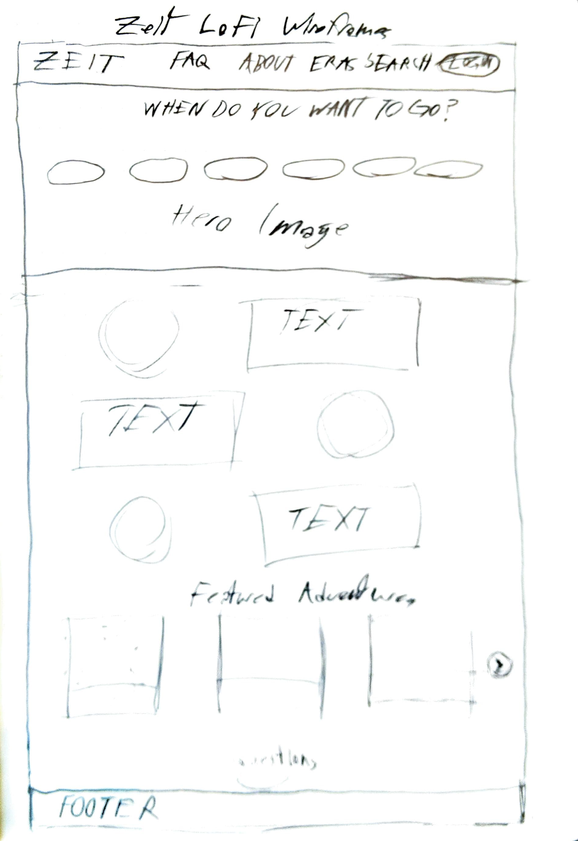
Wireframes
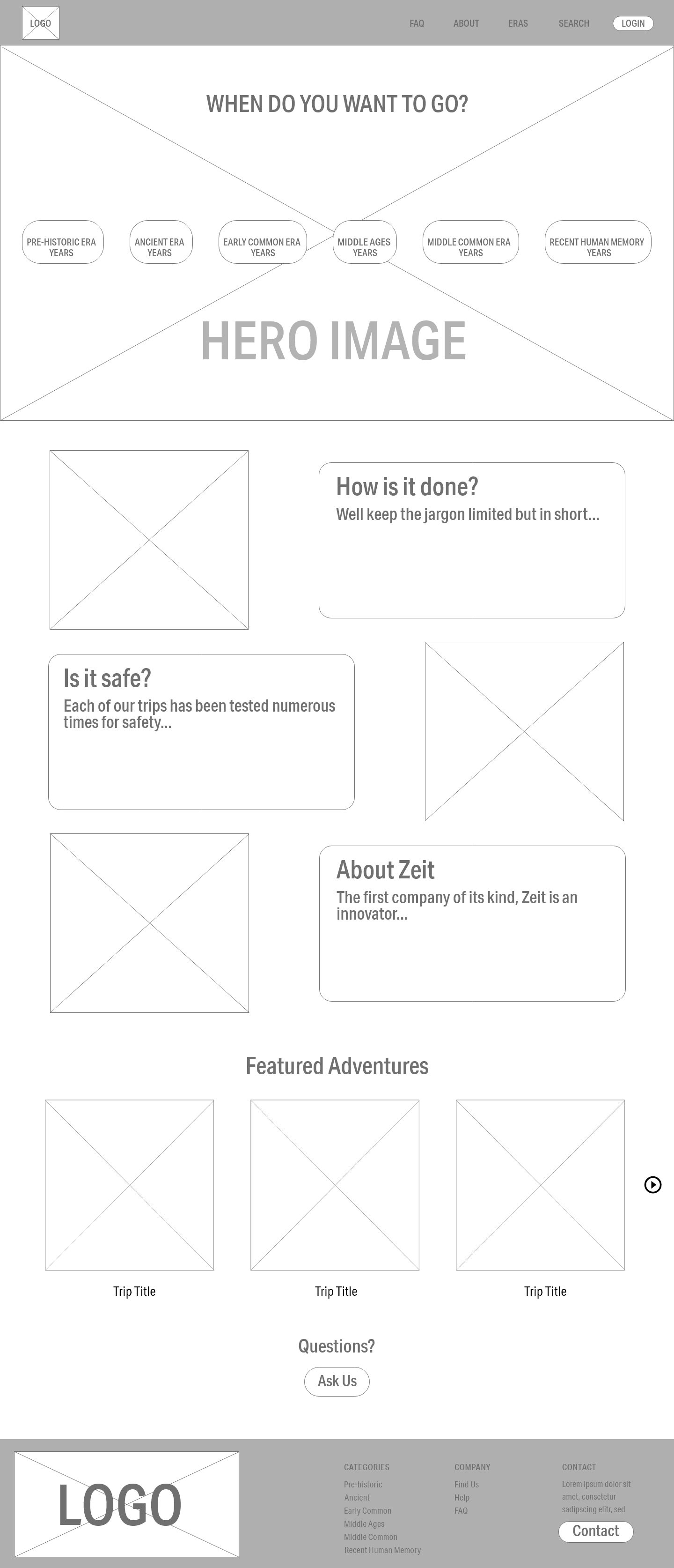
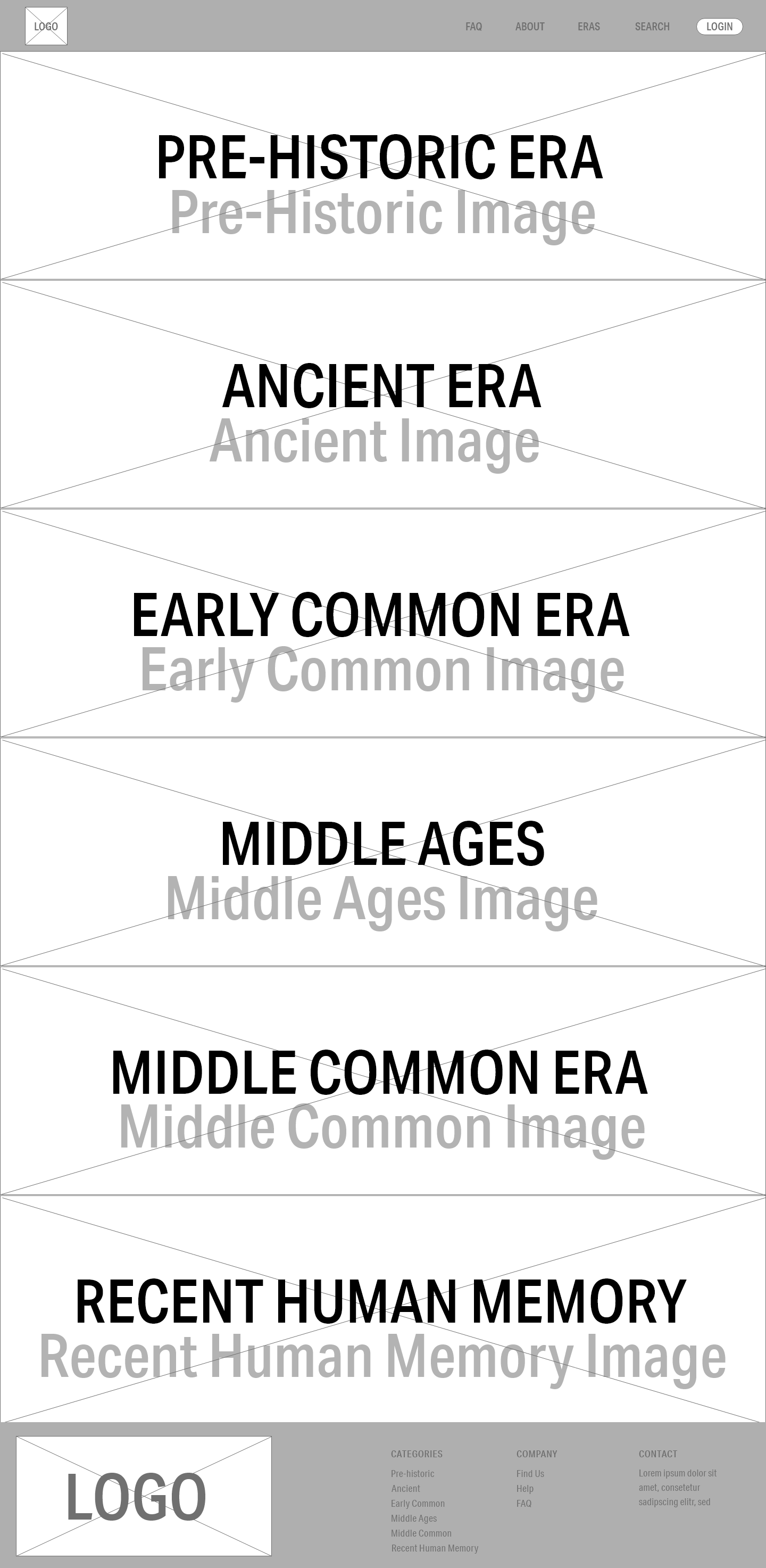
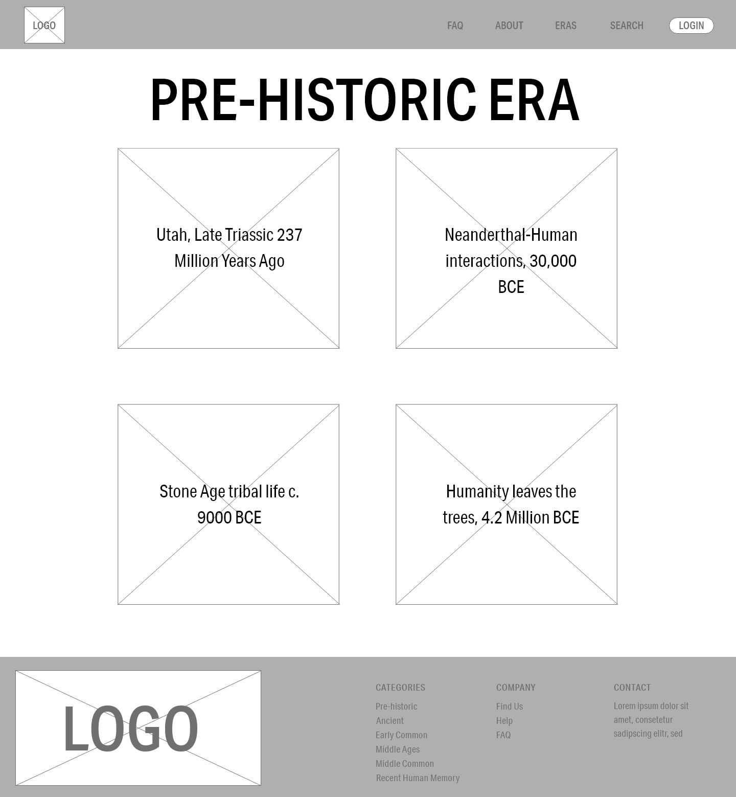
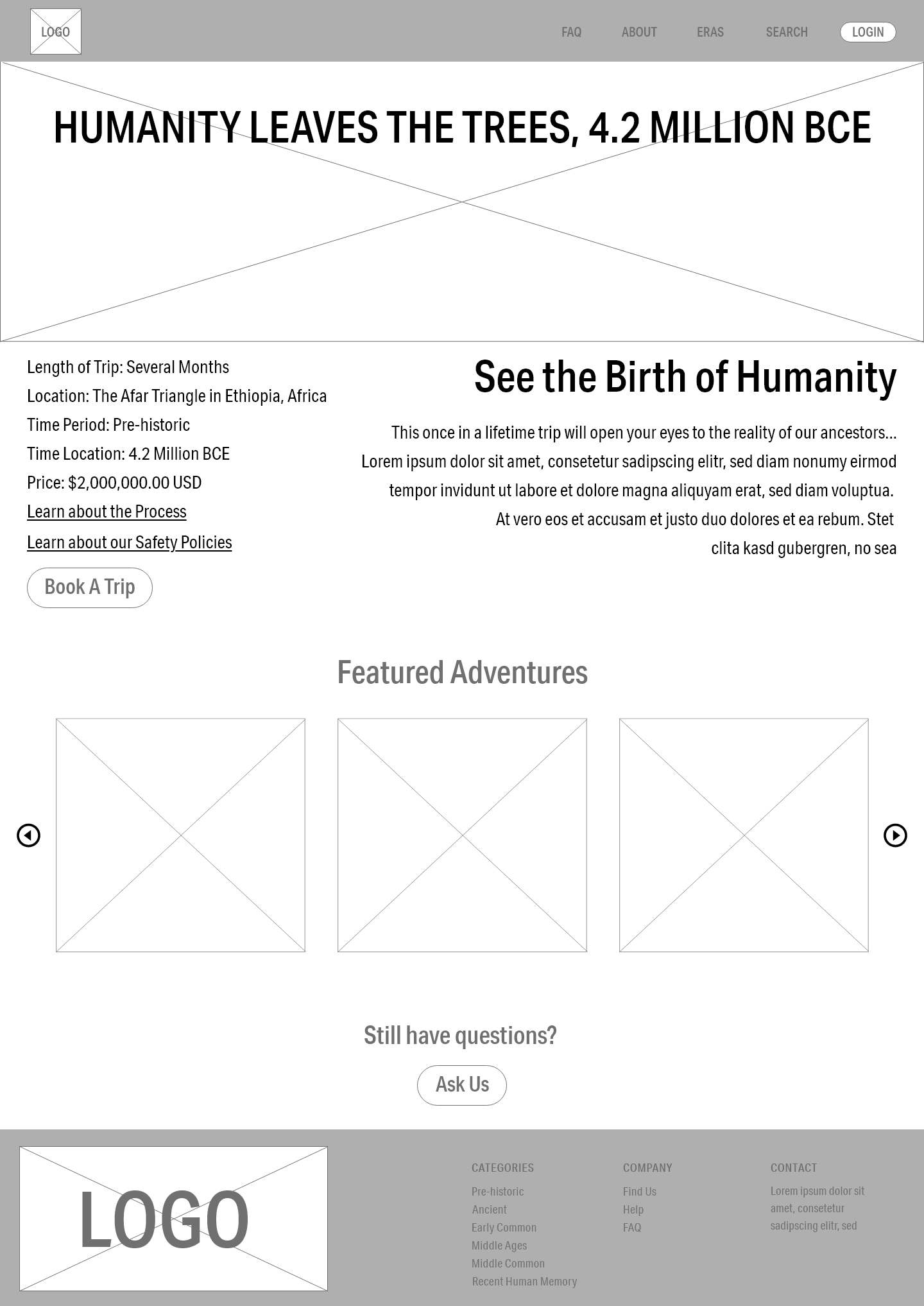
I drew up some wireframes based on the above sketches as well as tweaking and changing it to more accurately reflect what the research told me. I also used my research to help me make decisions with regards to the header, footer, and type sizes.
Style Tile
I meticulously chose a palette to conjure images of both modernity and antiquity, and tried to do the same with the typefaces. I also created the sundial inspired logo, after some sketching. Ultimately these elements lead to a subtle and dark website with muted colors.
Final Designs
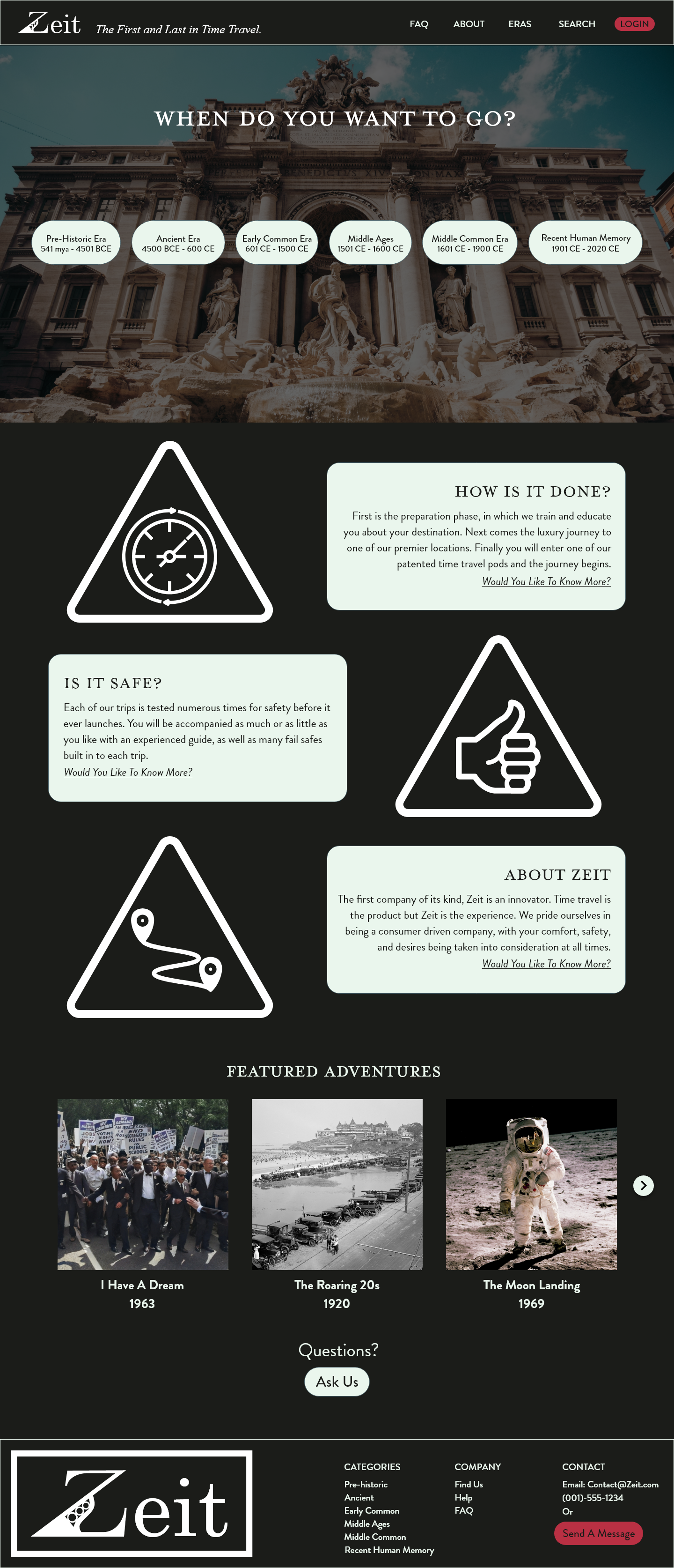
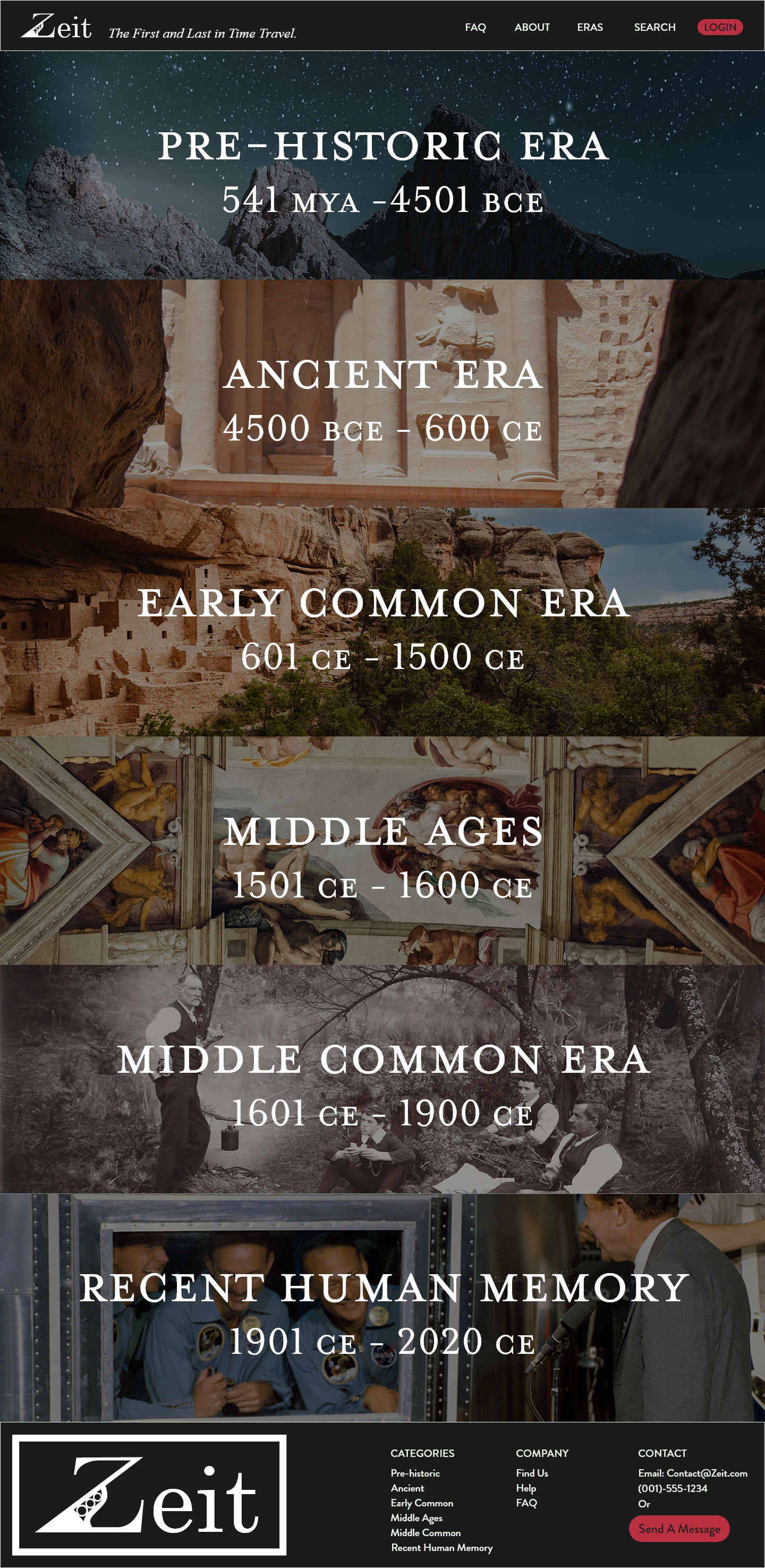
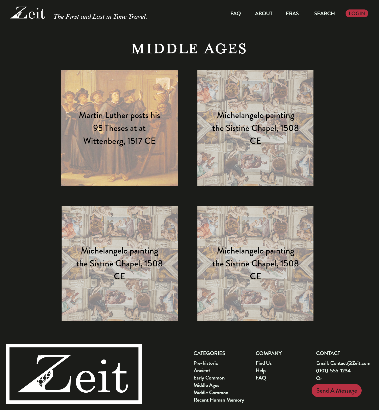
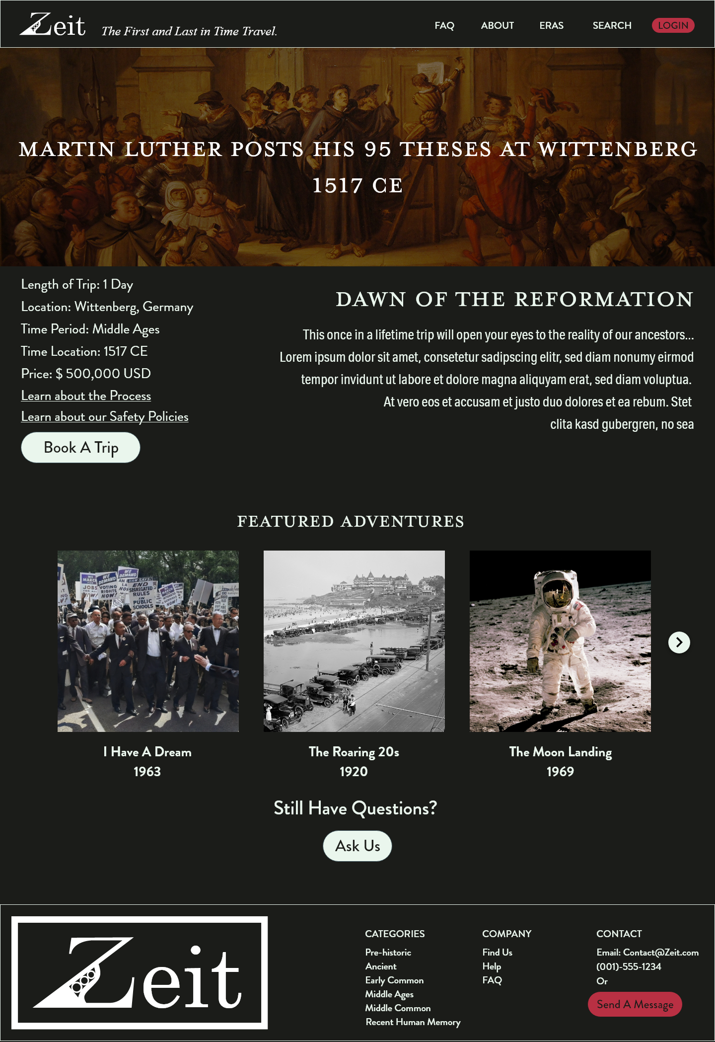
Through further user testing and some thoughtful visual design, I was able to produce these final screens. I wanted the dark modern theme reminiscent of museum, while also allow striking visuals to draw the eye through the flow of the website. The homepage was made to easily guide people towards information about the process, and the trips themselves.
Conclusion
This project was entirely self-led, self-directed, and self-inspired. I learned a great deal during this project, and learned how important the user is in directing the design decisions, while also trying to keep aesthetics in mind.
