Visual Design Process
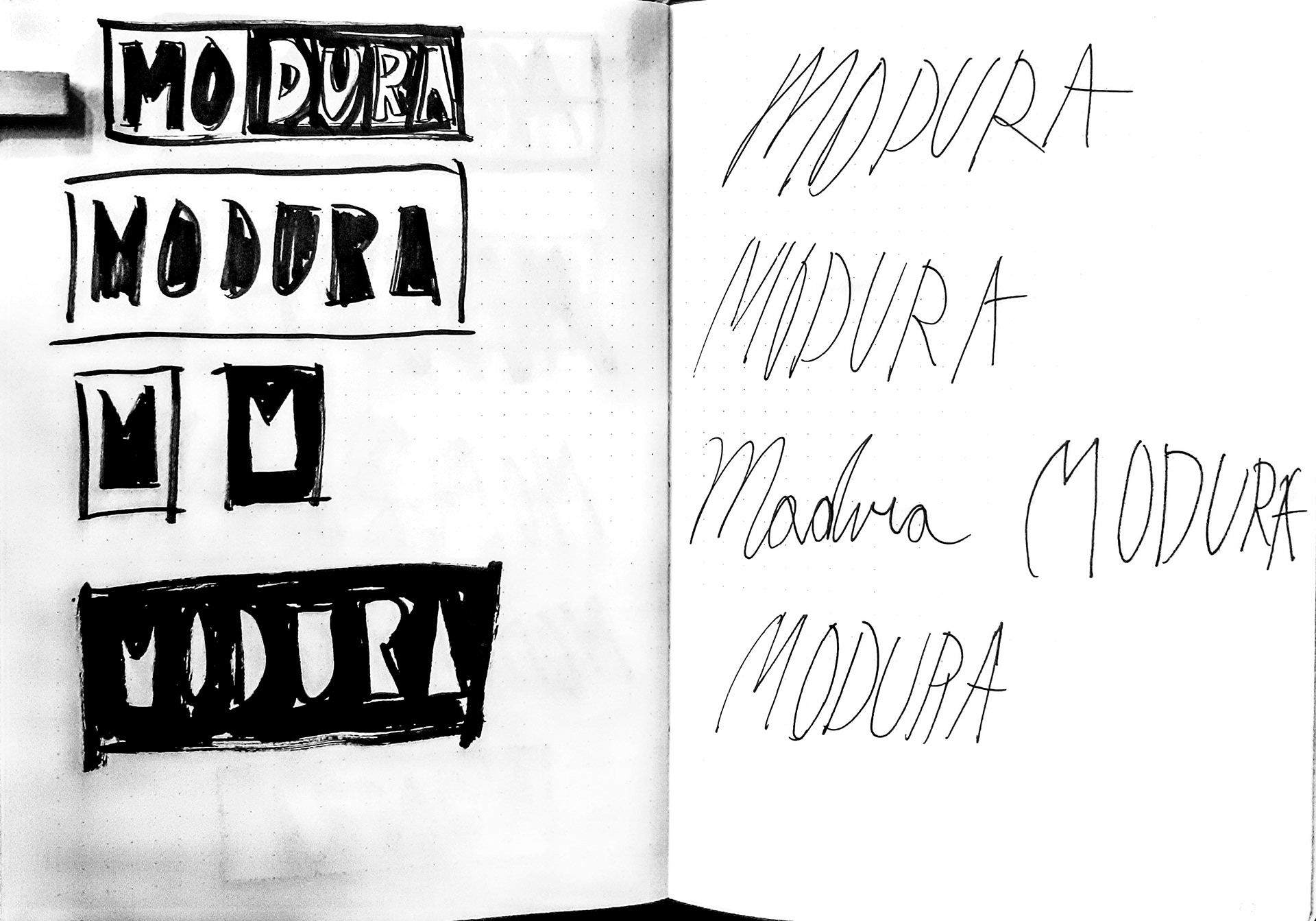
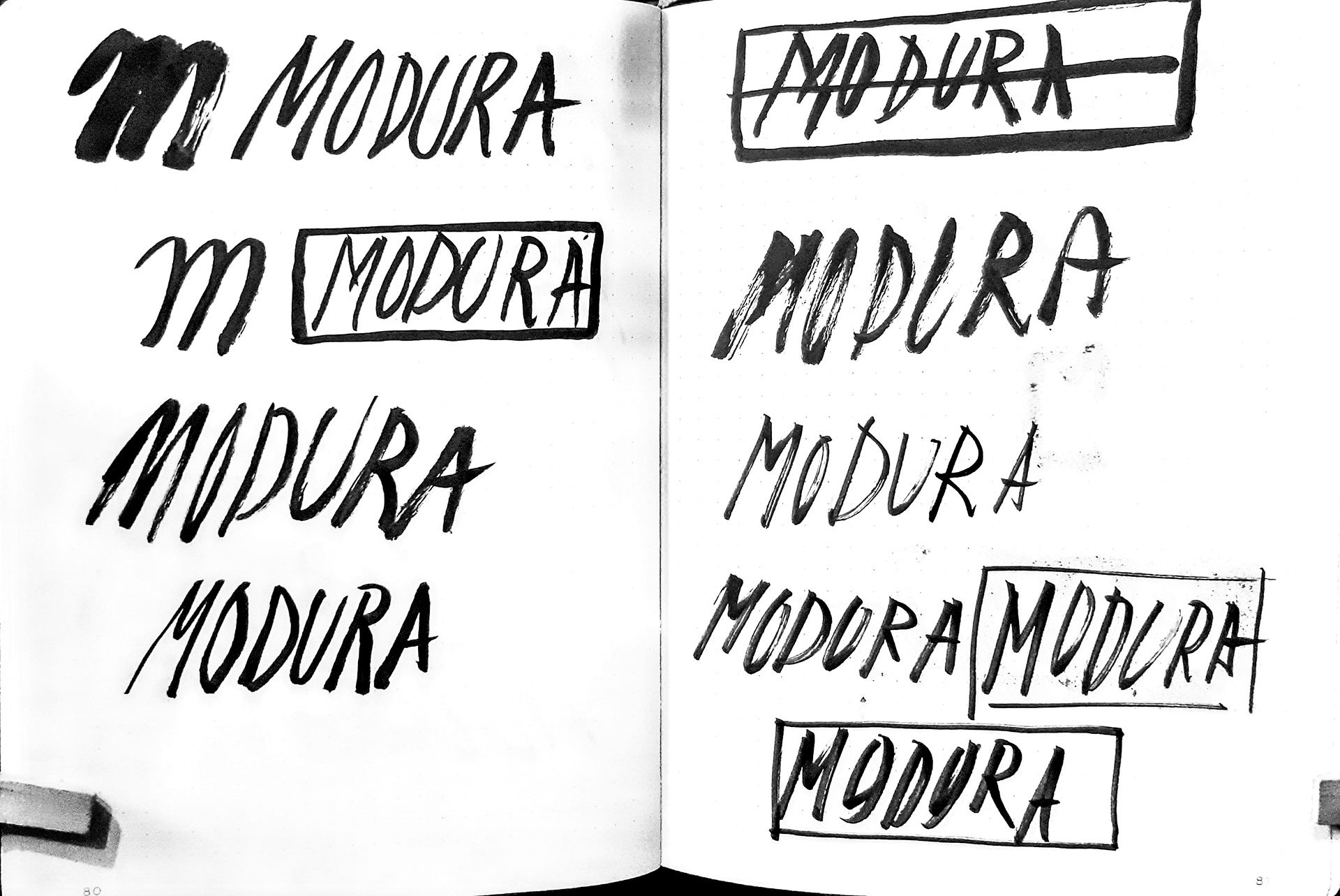
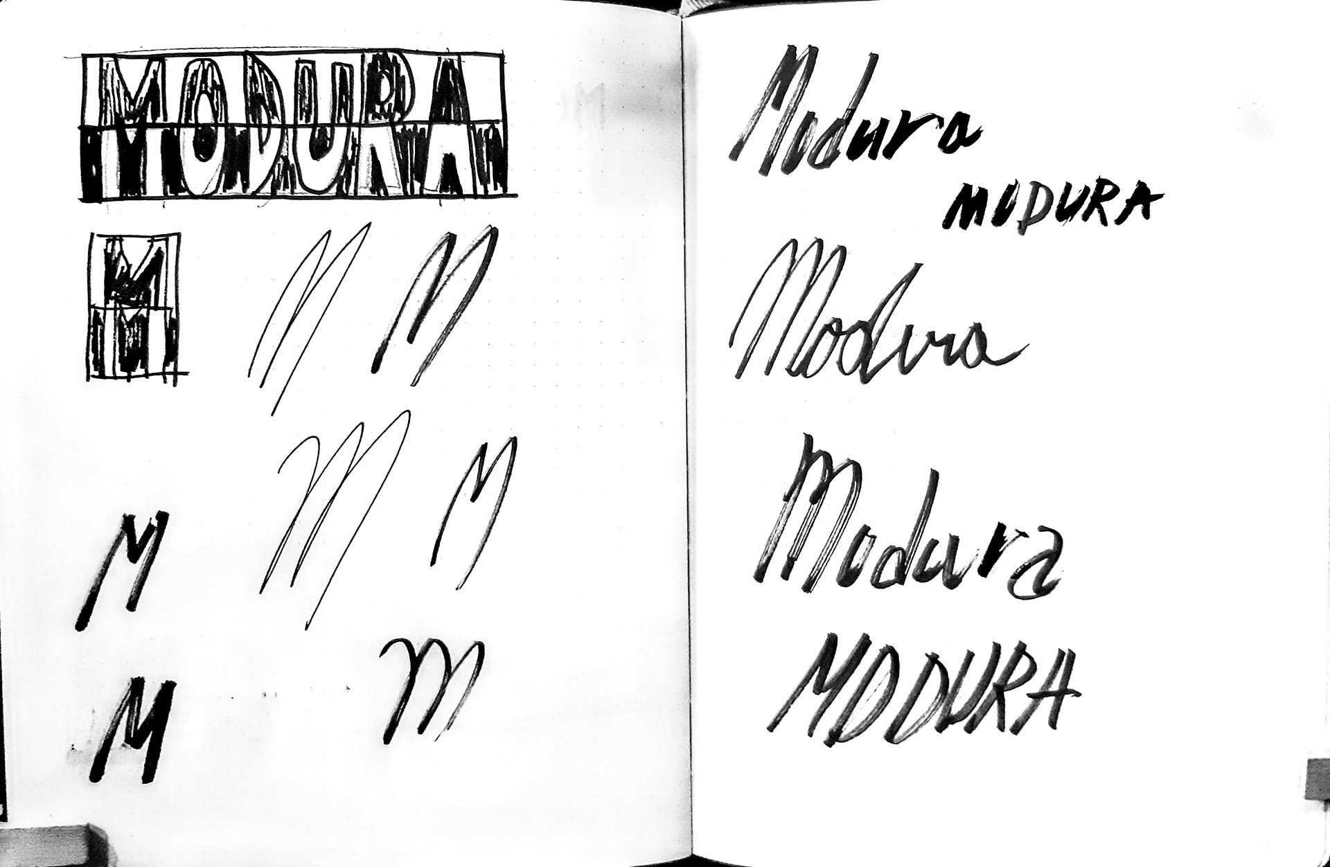
I started with research into fashion logos. Many of them are wordmarks or lettermarks so I decided to go in that direction. I played with negative space, and also making very handwritten marks.
I focused on the typeface here, and I think it helped with the development of the logos. I wanted them to have a elegant modern feel, so I tried keeping it pretty simple. For the responsive resizing I kept almost everything the same, but changed the borders slightly for better visibility and transformed the wordmark into a lettermark for the smallest size.
Ultimately I used Azo Sans, a San Serif font, with some humanist and some geometric aspects. San Serif fonts are common in logo design, because of their legibility.


