Overview
This project started from a simple prompt: make an an intuitive, easy-to-use application that allows organizations and individuals to donate food easily and smoothly.
The Challenge
This was my first end-to-end mobile application design, and because it was an application that has few competitors, there was not very much primary reference material. This meant the main challenge was figuring out what design systems to use, and what image fits best with the brand goals.
Phase One: Research
Research Goals
- Find out what delivery/pick up apps are popular so as to ascertain some information about what design systems will be relevant to this project
- Discover how much time and effort users are willing to commit to reducing food waste
- Learn more about people’s relationships with food and food waste
User Interviews
I conducted several interviews with people who I knew had either worked with food, or had bought food in bulk before. Most of the questions centered around the participant's relationship with food and food waste. With a few questions about food related apps.
I found the following to be true of all the interviewees:
- Have a mostly positive relationship with food, and enjoy cooking in their personal life
- Have some experience with delivery services, particularly GrubHub
- Dislike food waste and try to mitigate it in their own lives
- Were willing to spend around an hour or more per week to reduce personal food waste
- Would be motivated by goodwill to reduce food waste, regardless of compensation
- Thought food waste in the USA was a crisis, and that there is an ongoing problem where there is excess food, and people starving
And finally two contrasting cases:
- One participant had worked in small restaurants that allowed workers to take the excess stock
- Another participant had worked in a national chain that necessitated the destruction of many lbs of excess stock
Survey Findings
I created a survey to get some basic information about people's feelings around food waste, and food delivery apps.
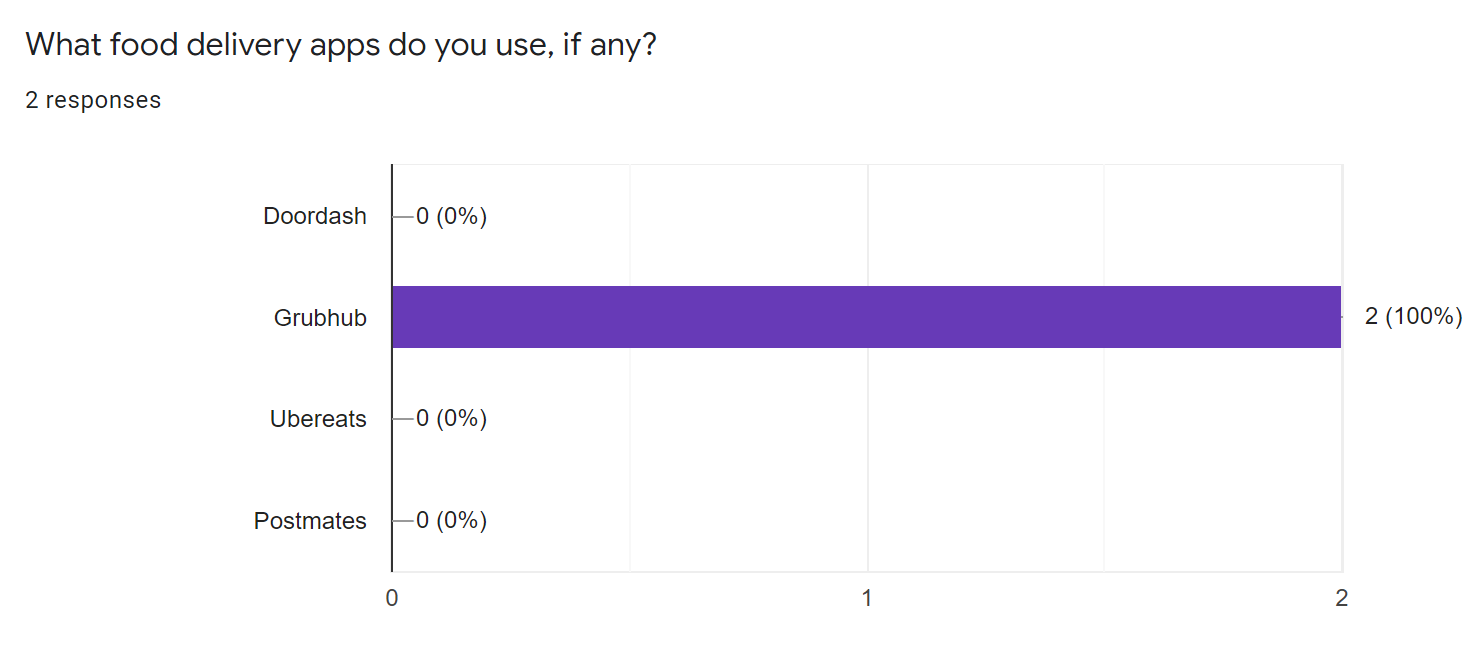
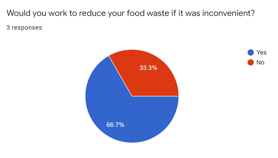
The charts to the right, illustrate the most important lessons I learned from the surveys.
Firstly, that Grubhub is the app too look at for mobile app design systems and inspiration.
Finally, that most people would work to reduce food waste even if it was inconvenient.
Phase Two: Define
Personas
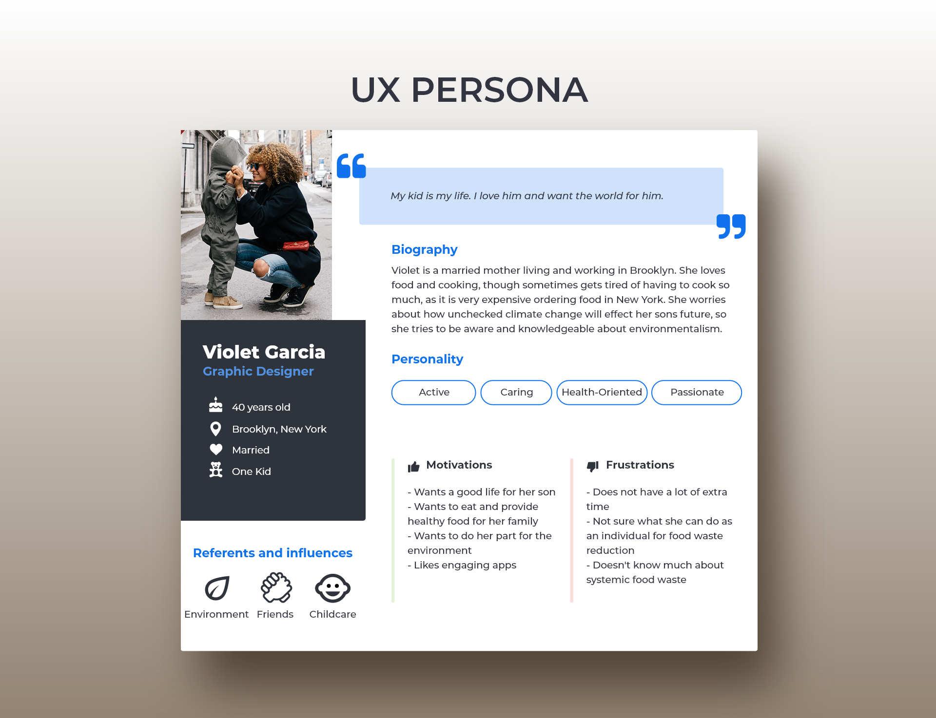
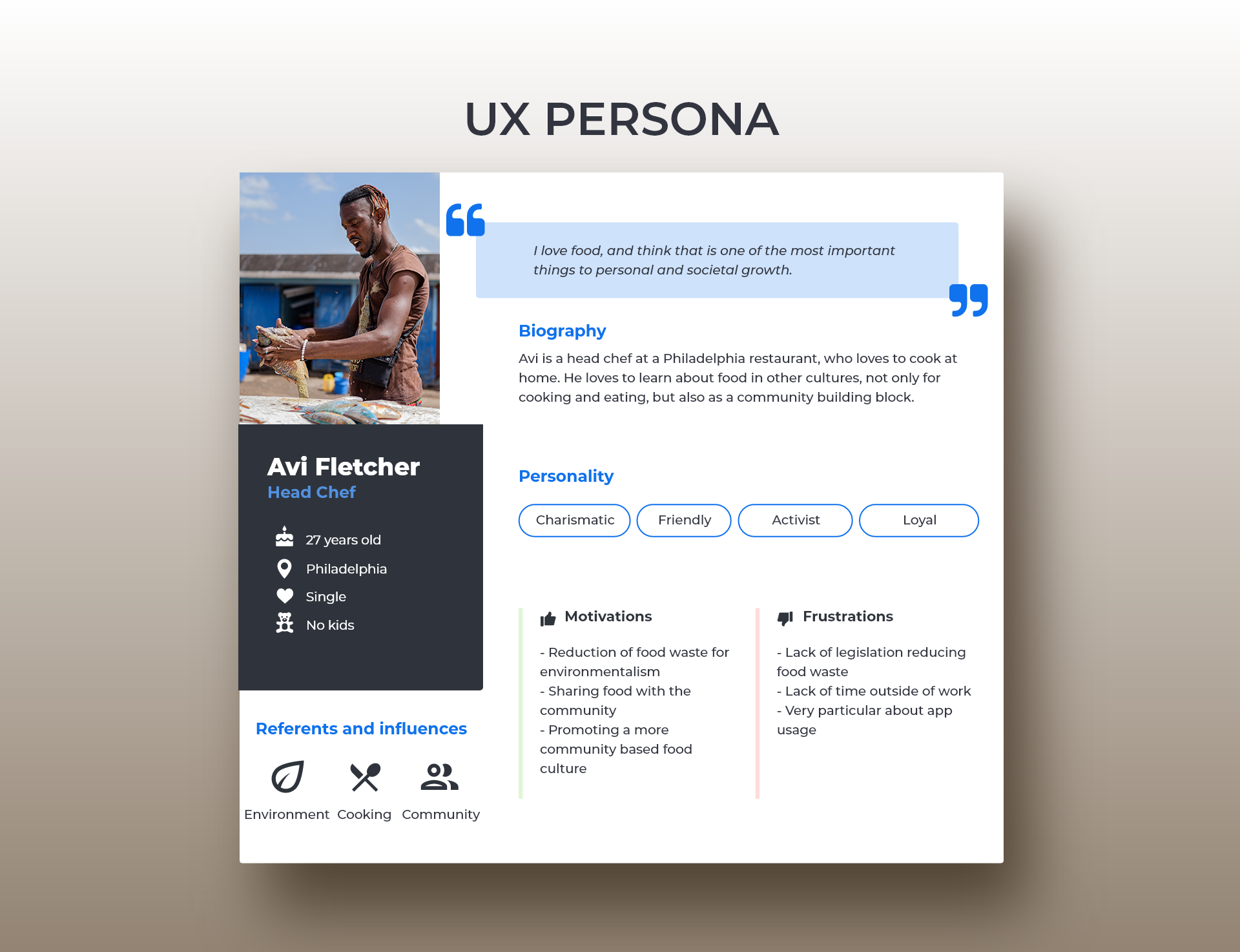
I made two personas to represent different types of people and their relationships with both food and food waste. In part based on my research, and in part based on people I know, as I think all good personas are.
Violet was inspired by all of the hard working caregivers who sometimes make or buy too much food, but care deeply about the planet and it's future.
Avi was inspired by caring chefs who have to watch excess stock be thrown away every night, and wish there was more he could do.
Roadmap
I constructed a simple roadmap of potential features, to help keep my process organized and to conceptualize what the final app would look like.
App Map
I wanted to keep the flow of the app simple, and so I made a simple App Map. This helped me figure out which screens I needed to create, as well as further organizing my thoughts.
Phase Three: Design
Preliminary Sketches
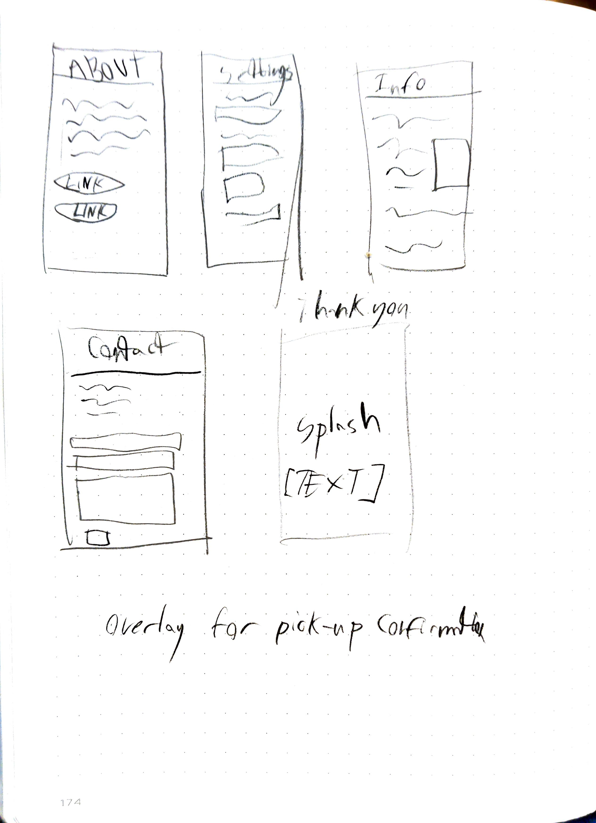
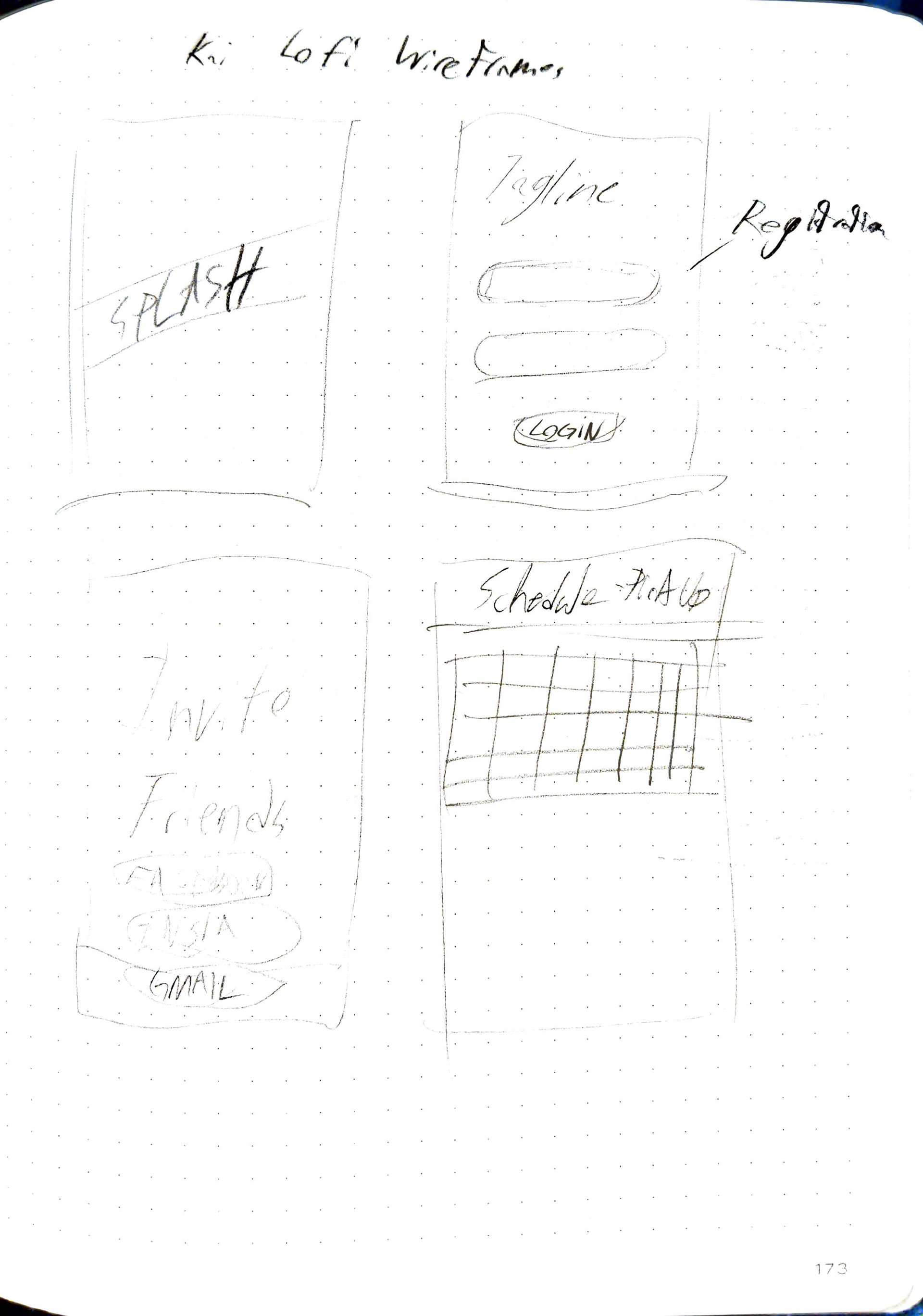
I had done my research, it was time to design. I drew up some loose sketches of the main screens I intended to make. I also used this time to look up what are common design choices for app splash screens, login screens, etc. and consider how I might make my own choices, or borrow design patterns from other apps.
Wireframes
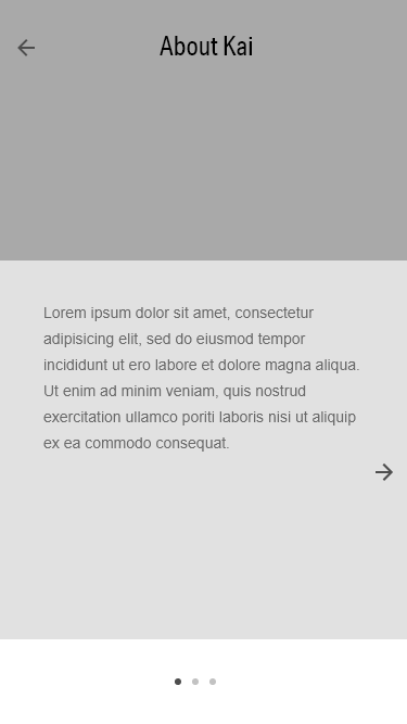
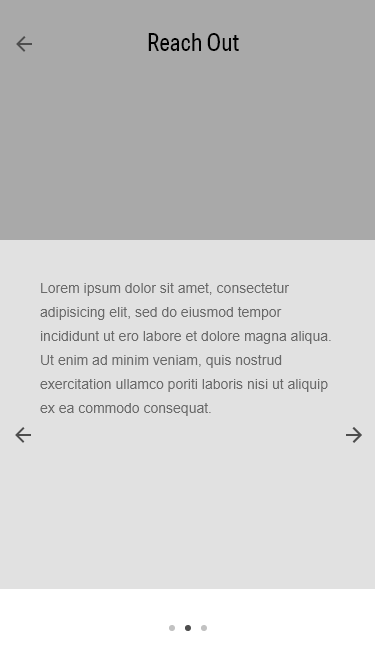
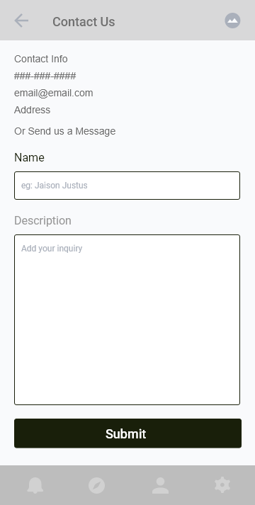
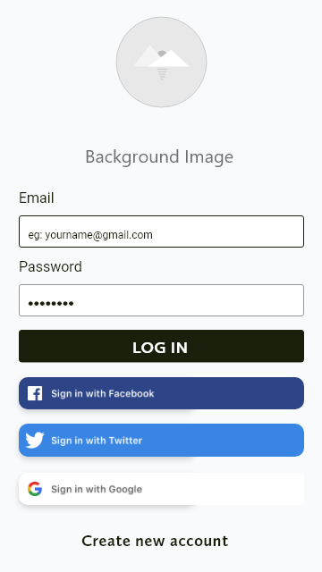
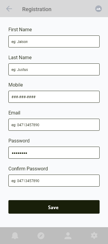
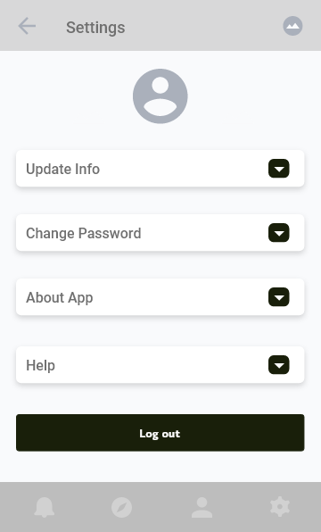
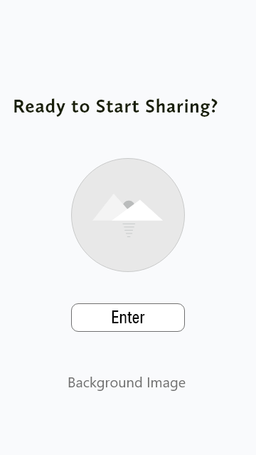
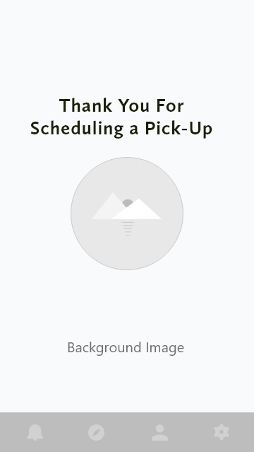
I created these wireframes in much the same way I made the above sketches. I looked at common design patterns in mobile apps. I also looked at templated that could be altered or restructured to better serve my purposes, all the while shouldering some of the burden of pixel pushing minutiae. I was ultimately very pleased with my simple wireframes and looked forward to adding colors and images to bring the app to life.




Usability Testing and Affinity Map
I did some basic usability testing with a fully designed prototype, and then drew up this affinity map to synthesize my results. I then did a new iteration of the design, with these pain points in mind. I rearranged the nav bar and changed the text overlay.
Final Designs? (Not Quite)
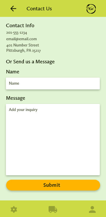
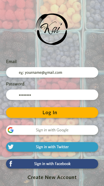
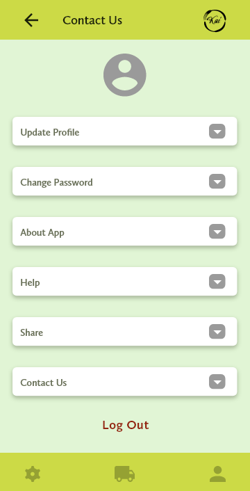
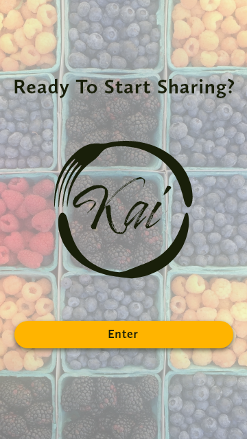
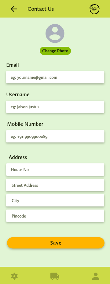
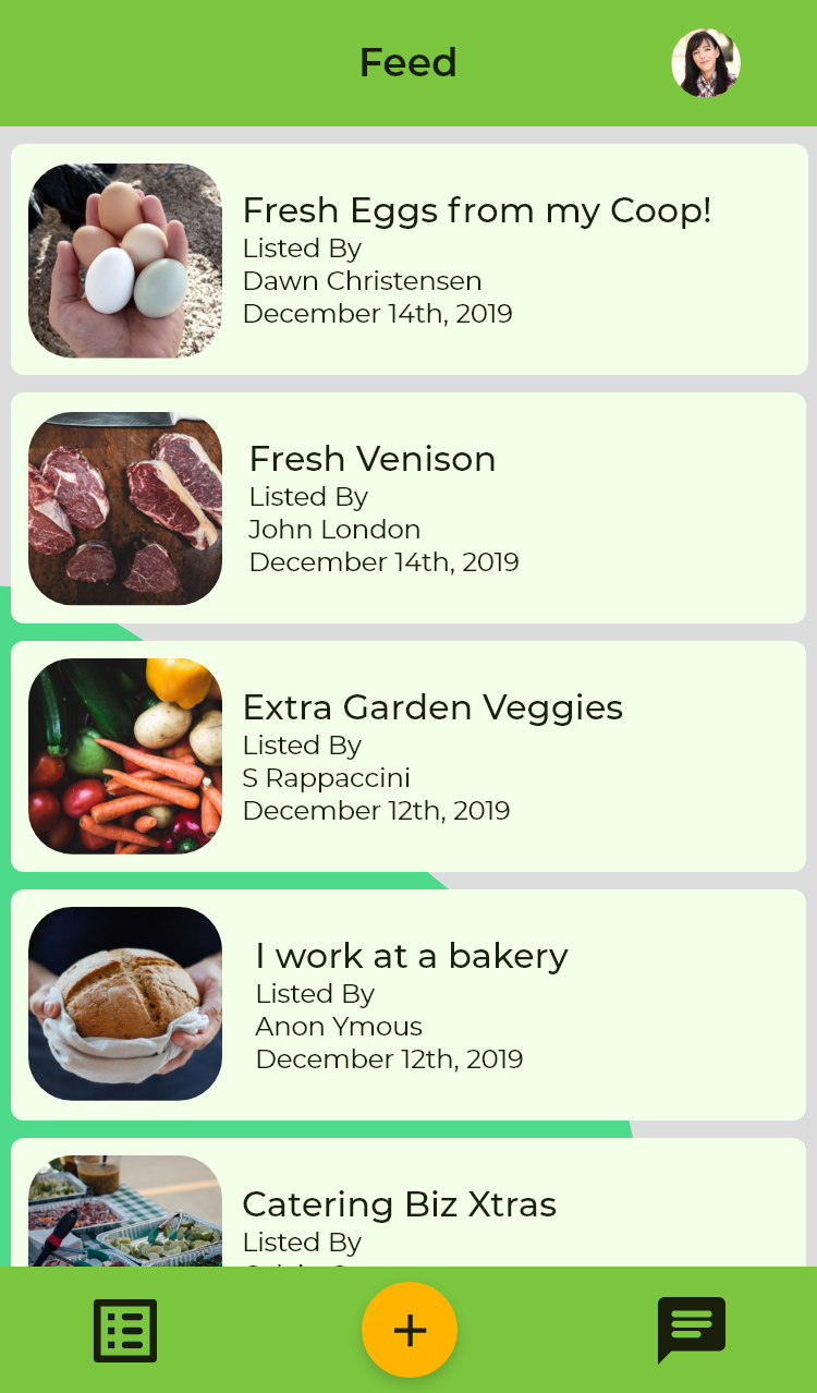
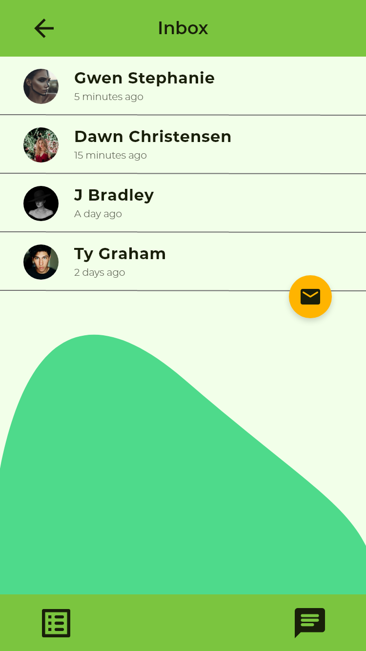
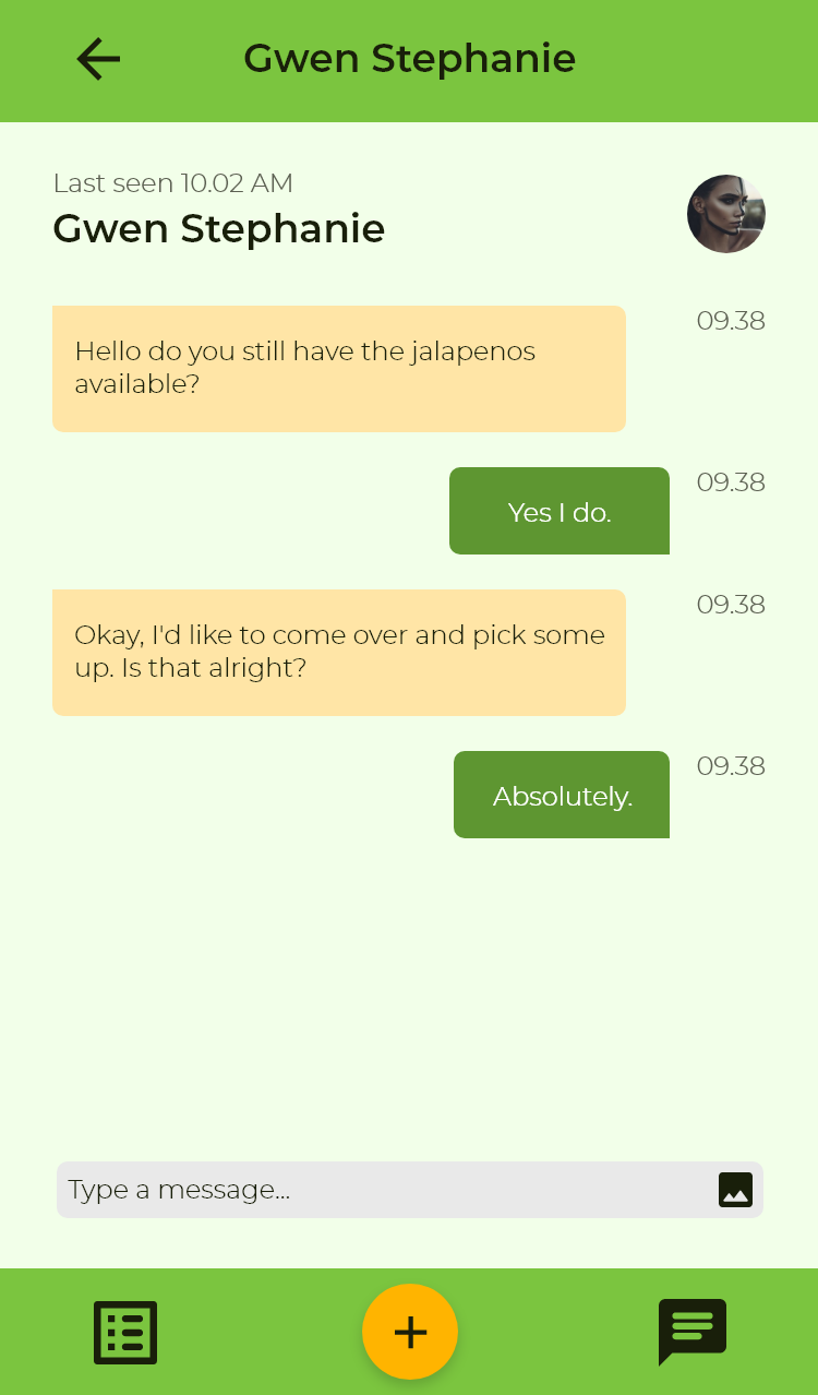
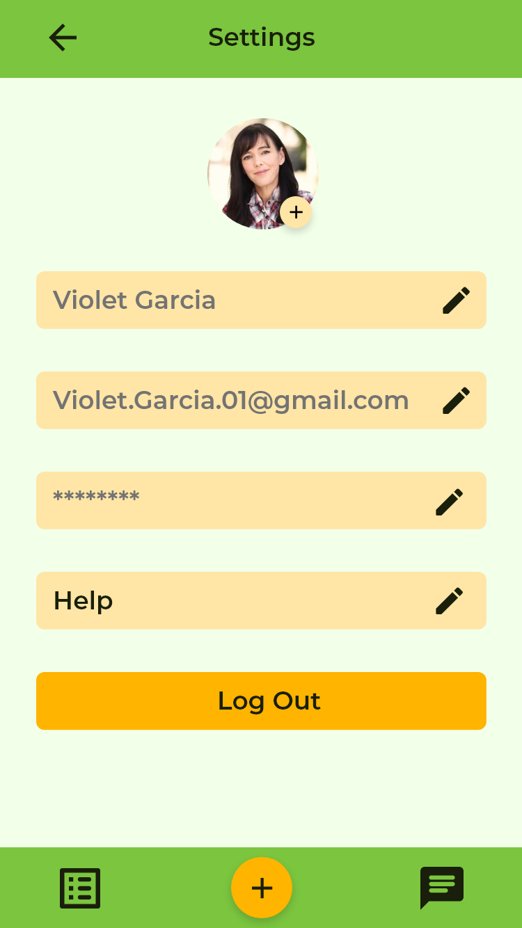
It took a few iterations to get the color, contrast, and composition right, but I was happy with the final result. The bright yet earthy palette and the simple elegant navigation bar were two of my favorite parts, but I was far from done. The screens below are version 1 of Kai.


Version 2
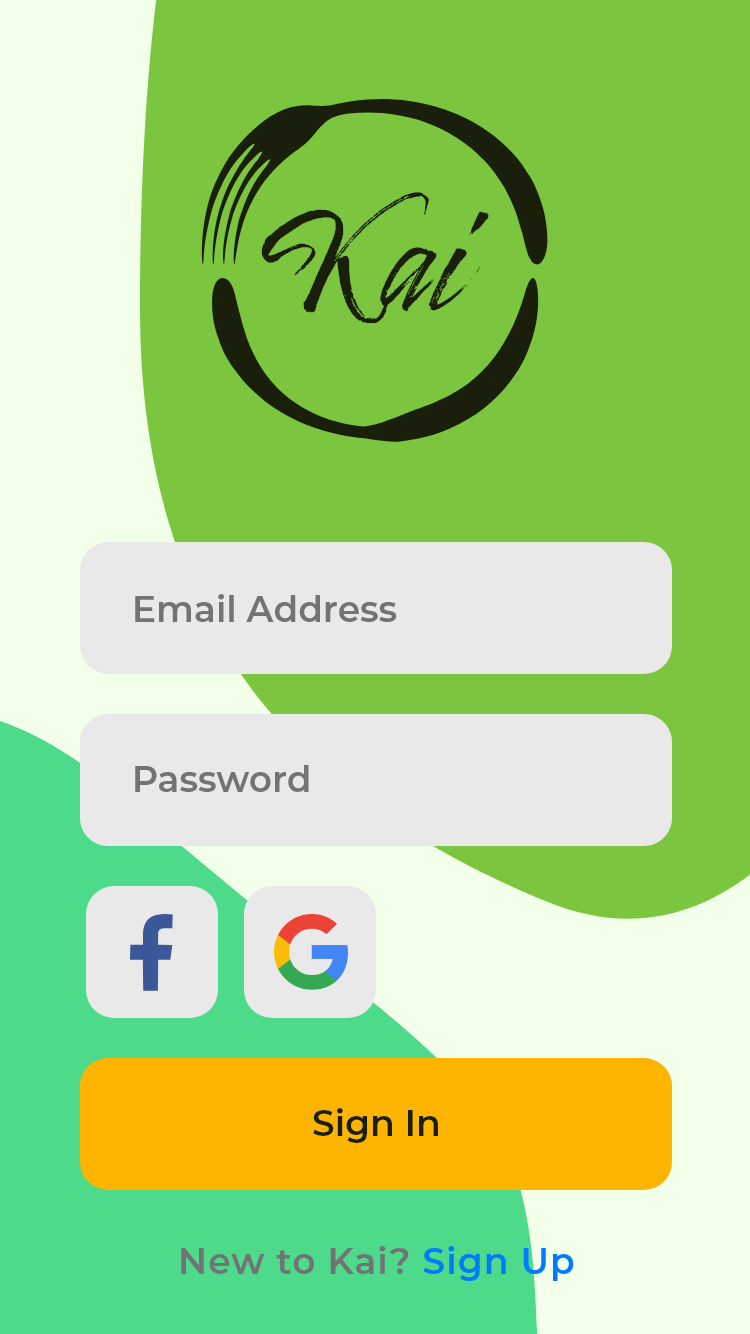
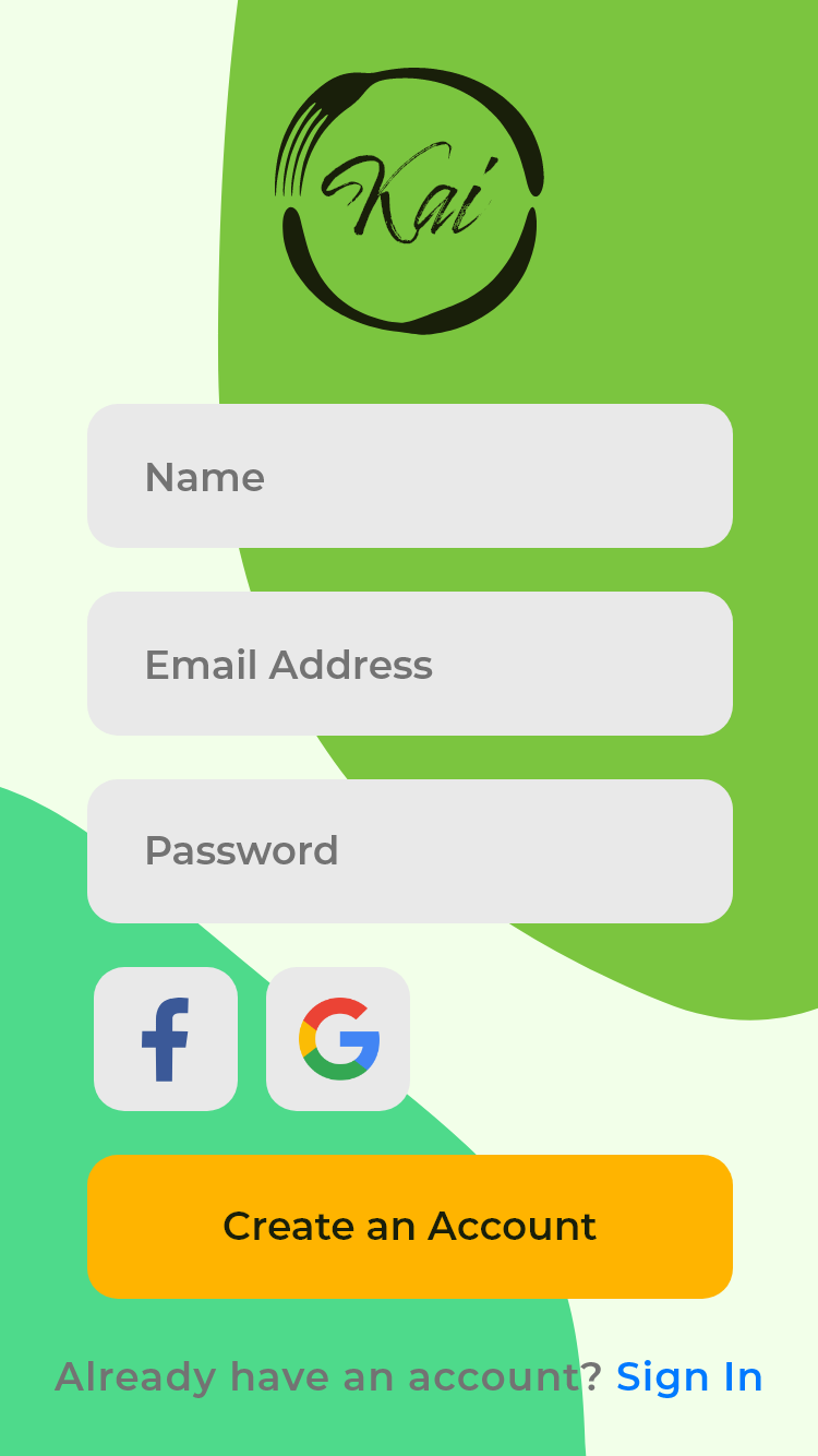
I thought I was done, until I got another pair of eyes on it. Another valuable design lesson to learn. He told me it looked dated and pushed me to update it and look to current design trends for inspiration. I used what I had learned from my research for version 1, but I also ended up remaking almost the entire app. I made new task flows, I added more features and I did a lot more research on popular visual trends. The resulting app is hugely improved visually.
Task flow for Version 2


Conclusion
This was probably the most ambitious project I had undertaken yet. I had never designed an app, let alone from end-to-end, but food waste reduction is something I am passionate about, as are many of my friends. Allowing my passion to guide my research and design made this project, fun, rewarding and a valuable learning experience.
