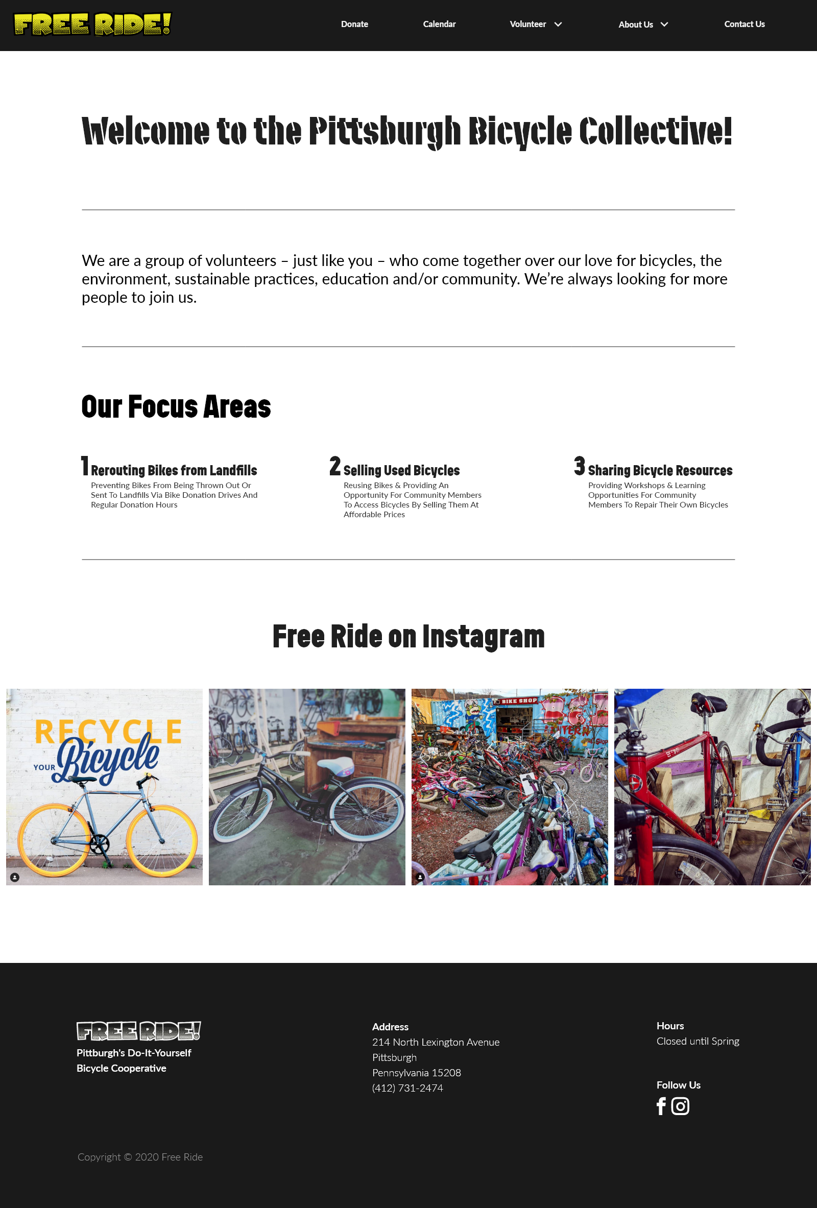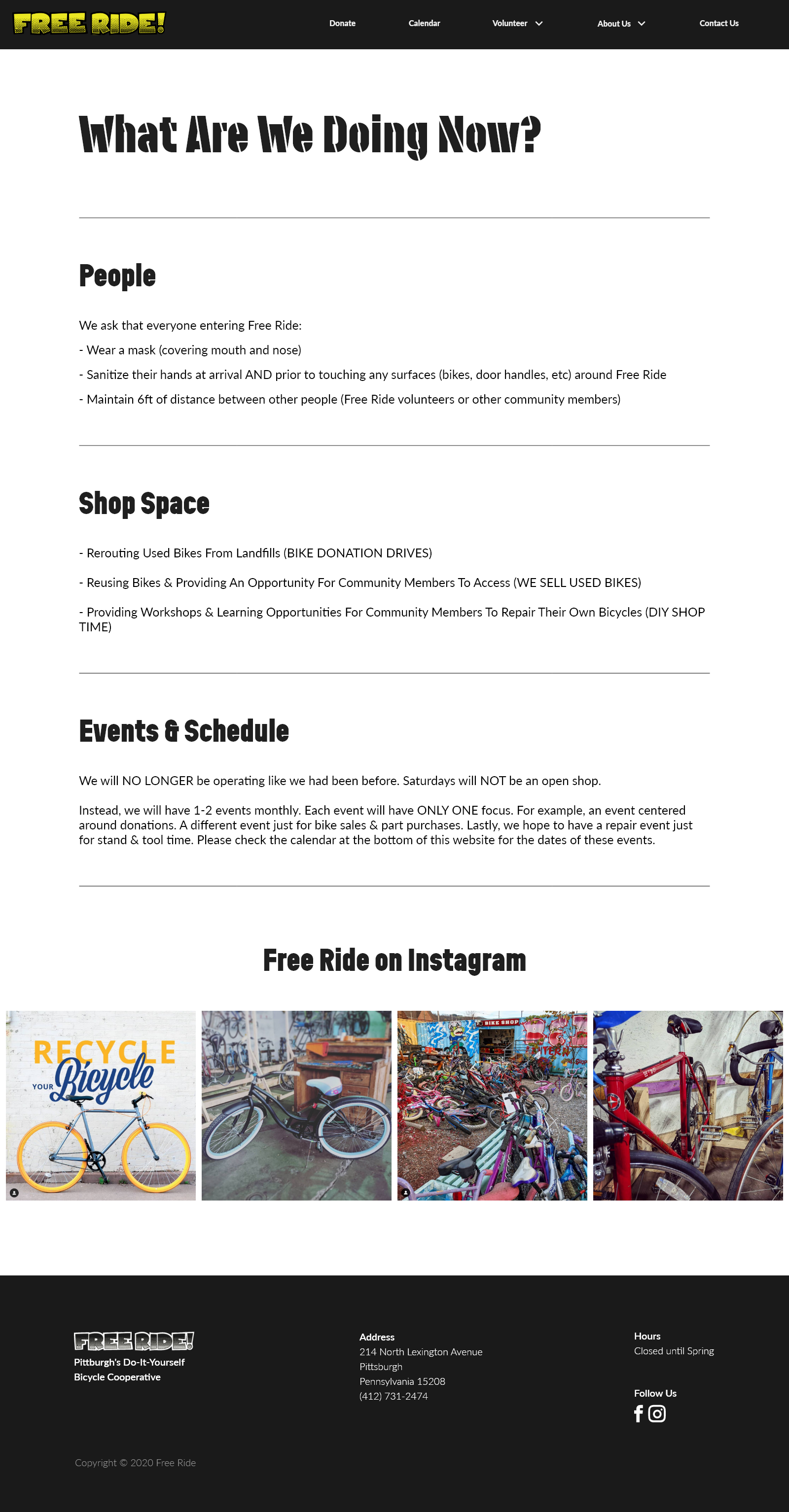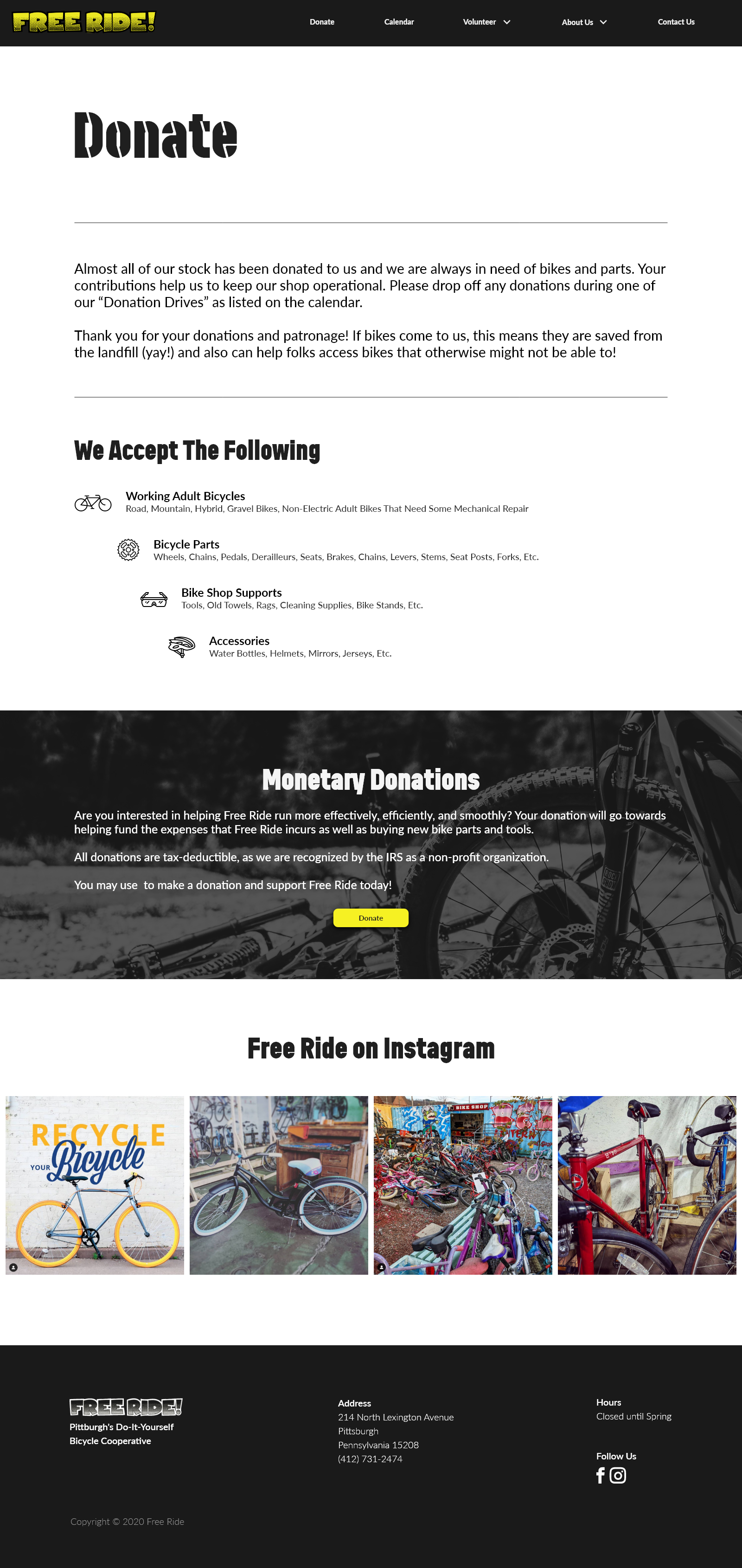
Home Screen created by Hana Jimenez - Mockup PSD created by customscene
Background
Free Ride is a Bicycle Collective located in Pittsburgh, Pennsylvania. They are an impressive and wonderful organization, but because they are volunteer-run and very grassroots, their website has not been updated in some time, limiting their channels of communication. I worked next door to them for several years and fielded some inquiries about them, so I knew that improving their website might help with their image and client interaction. I proceeded to approach the project with both design thinking and developer work hours constantly in mind.
The Challenge
I needed to redesign the website while keeping in mind:
- Future developer hours will be limited and on a volunteer basis
- The flow of the website must be very usable and easy to understand
I also needed to make a mobile version of my redesign, while keeping the above points in mind.
Phase One: Research
Research Goal
My research goal was to ascertain from the users, both internal and external, what are the current pain points, how they would like the brand to be expressed, and to make the website more accessible overall.
Interviews
I conducted a series of interviews of people who I know had some history cycling in the city of Pittsburgh. The interview questions were fairly simple and I was able to draw some pretty good conclusions from them. My findings were as follows:
- None of the interviewees, all of whom are familiar with Free Ride, have used the website.
- In order to find out hours, only ⅓ of the interviewees would go to the website as a first choice.
- All interviewees would contact via phone, not email, or through website.
- ⅔ of the interviewees said Free Ride is their first choice shopping for bikes
- All interviewees said that ease of access with readily available information is the most important thing to them when using a website
Immersion
I also did some immersion testing as I have interacted with Free Ride on more than one occasion and felt comfortable putting myself in the users shoes. My process was to set myself some tasks and then record myself thinking out loud through the process. I then recorded it to organize my findings. The tasks were:
- Find the hours of operation
- Contact them via Email
I accomplished the tasks and was able to quantify the findings as follows:
- It took about 5 minutes to find their hours, especially considering the COVID-19 crisis. The information turned out to only be available on the Facebook and Instagram accounts.
- It took only about a minute to find a way to email them, though it was only available as a form to fill out.
Competitive Analysis
I created a competitive analysis to help analyze the current common trends among Bike Co-operative websites, and also to get ideas for what changes could be made to the current iteration of the Free Ride website.
Phase Two: Define
Persona
I created a persona primarily using my findings from my two research methodologies, while also adding life details to flesh out the character.
Product Roadmap
This product roadmap was created to help guide my thinking with regards to the necessity of certain features and the priority of others.
Phase Three: Design
Wireframes
Using everything I had learned from my research I began to make wireframes for the redesign. I used the same basic structure, so as to not over burden the developer, while improving the flow and appearance.
Prototyping and Testing
After designing the wireframes I then made a prototype for user testing. For my testing I conducted three twenty-minute Usability Tests of my medium fidelity wireframe prototype for the Free Ride site redesign. They each consisted of a remote call with audio and screensharing. I gave each of the participants 3 tasks and timed how long it took for each of them to be completed, on the prototype. I also asked what impressions each user got from the design. For two of the users I also had them compare my design with the current site, to tell me about their impressions of the two sites in conjunction.
My main takeaways were as follows:
- The copy regarding the hours and openings is a pain point
- In depth description of what volunteering entails should be easy to find and access
- Positive redundancies were well received
- Simple, easy-to-read layout was well-received
I then created an affinity map to organize the results.
Affinity map illustrating the results of the usability testing
User Interface Design Final Steps
With all of that research and testing done I created a style tile based on the current brand colors and used it to make my first version of the final UI Screens.
Version 2
I was not satisfied with the first version, it was flat and too under-designed. After some review and consultation I changed up some of the components for a more modern look, while maintaining the simple flow.
Version 3
After further iterations, consulting, and a bolder vision for the final product, I designed the final version. This version took much more inspiration from the grunge aesthetic movement of the 90s with particular inspiration from David Carson.
Final Version
While keeping in mind all of my user research, I did one final redesign. With some mentorship, and inspiration from other modern cycling websites I created this final version. I sacrificed some user friendly redundancies for aesthetic, while keeping all of the most important things visibly available. The result is a much slicker and polished website, that better reflects contemporary design trends.


Conclusion
This was a deeply iterative project, and that provided me with a valuable learning experience. Design is not about creating a sculpture, permanent and beautiful, but about creating an ever-changing experience. As with any good piece of art, the process for the creator should reflect the experience of the user.
